Digital Reports
Digital Reports is NETZSCH's batch-reporting platform for industrial grinding and dispersion. I redesigned the core modules from lowfi to hi-fi in Figma, then rebuilt the product as a working coded prototype that now runs ahead of the production roadmap: availability planning, machine rankings, a full batch editor, exports.
- 36
- Frames lowfi → hi-fi
- 32
- Jira tasks shipped
- 8+
- Prototype screens
Challenge
The product worked, but the UX had grown module by module with no common language. The Registry (the core batch table) was still lowfi. The dashboard's daily timeline used the design system's pastel status tokens, and the client rejected it outright: on a factory wall you can't tell an alarm from a maintenance stop in washed-out color. Settings ran seven tabs across seventeen frames with no consistent chrome.
There was also a physical constraint nobody had designed for: stakeholders validate this product on a 50-inch control-room monitor, where a 1280px-capped layout floats as a small strip in the middle of the screen.
Approach
Two tracks. In Figma, I pushed the shared design-system shell (header, sidebar, sub-header, tab rows) across all 36 lowfi frames with a script run through the Figma plugin, saving each frame's pop-up overlays first so swapping the shell didn't wipe them. For the timeline I dropped the pastel colors and hardcoded saturated status colors until the design system grows proper ones, because the client was right.
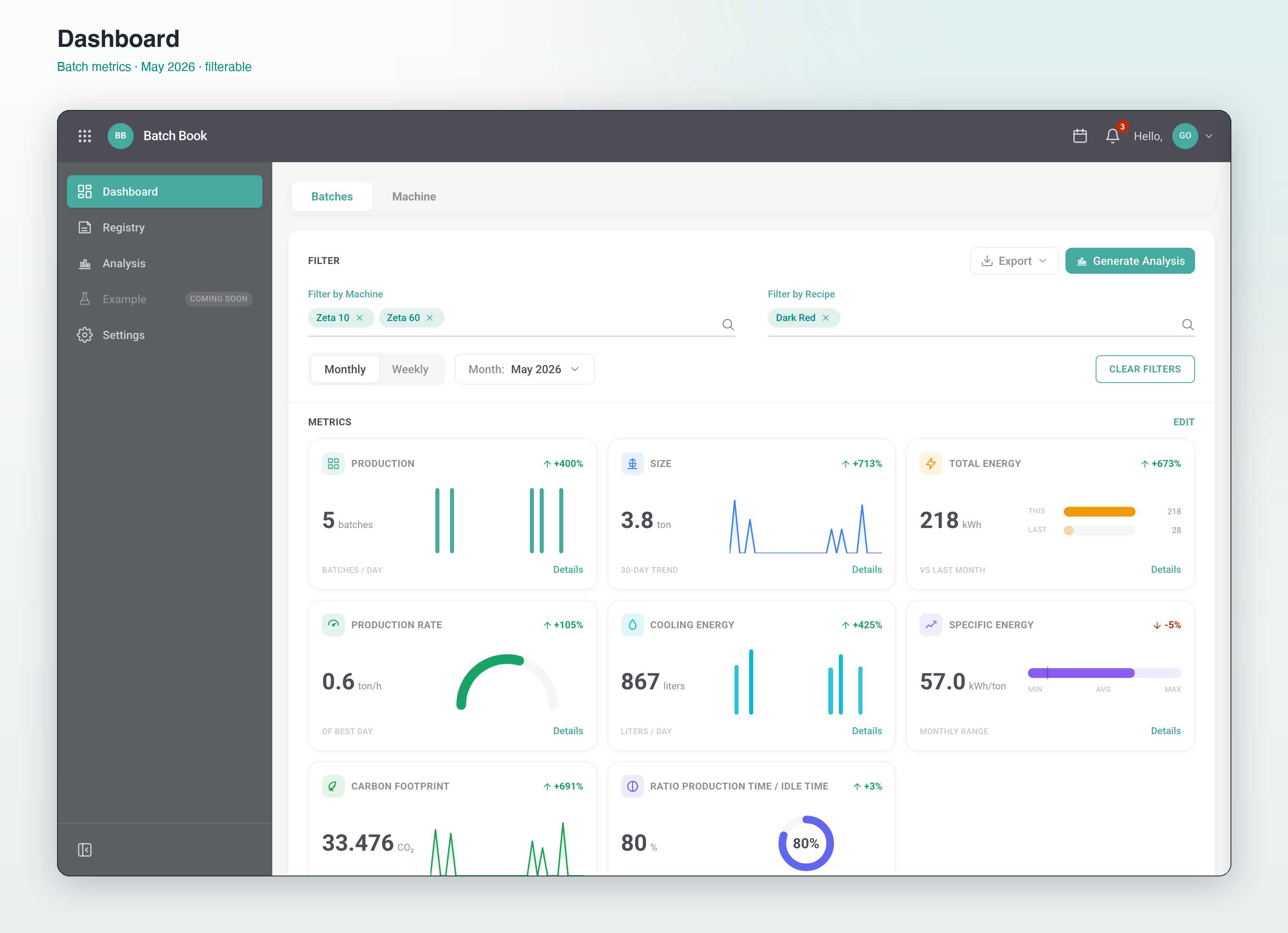
In code, I rebuilt the product as a working prototype (React, TypeScript, Tailwind 4) under the working title Batch Book, with every piece of data behind a single file I could swap out. That prototype became the proving ground: availability planning with a heatmap calendar and a plain-language assistant, machine rankings, a batch editor with a floating section nav, PDF/CSV/XLSX export, and fluid scaling so the layout reads correctly from a laptop up to the 50-inch wall monitor.
Outcome
The prototype is live on Vercel and is how the squad now validates decisions: stakeholders click through real interactions instead of imagining them from static frames. The 36 hi-fi frames live in the production Figma file, and a WCAG audit turned contrast complaints into four specific token fixes, taking the projected score from 68 to 92.
The mock layer is one file away from the real API, which was the point: everything the prototype proves is directly buildable.
Who I designed for
Production coordinators in chemical, pharma, food, and mineral plants, reviewing batch logs to answer one question fast: did this batch run clean, and if not, where did the time go.
Their managers read the same data at wall distance. That's where the color decision came from: a daily timeline in the Evocon style, one row per day, hour-by-hour status blocks in saturated green, red, blue, and amber. The design system's pastel tokens are fine for badges at laptop distance and useless at five meters. I kept the pastels for chrome and hardcoded the saturated set for status, and flagged the gap as a DS token request.
The key decision: prototype in code, not slides
The Figma frames answered what the screens look like. They couldn't answer whether the filters feel right, whether the planning calendar's heatmap reads at a glance, or what happens to the layout on the 50-inch monitor. So I rebuilt the product as running code and moved the open questions there.
The prototype outgrew its brief in a useful way. Availability planning (working schedules, holiday handling, a heatmap calendar, a rule-based plain-language assistant) shipped there first, validated with stakeholders, and now defines the spec instead of following one. Every interaction is persisted, every chart is real SVG against deterministic mock data, and swapping the mock service for the production API is a one-file change.
What didn't go well
I worked from an outdated note that said the body typeface was Montserrat. It's Poppins. Catching that late meant re-verifying typography across frames I'd already called done, which is exactly the kind of rework a five-minute check would have prevented.
The hardcoded status colors are a workaround, not a solution. They fix the washed-out timeline today and create drift risk tomorrow; the real fix is saturated status tokens in the design system, and until that lands this is debt with my name on it. And the prototype's polish cuts both ways: it validates decisions fast, but it reads so much like a finished product that managing expectations about what's actually wired to real data became part of the job.
Selected screens
" The WCAG audit made visible what design reviews kept missing: the primary teal fails contrast on white, and the fix is a token decision, not a cosmetic one. A 68/100 is a forcing function. Numbers are harder to postpone than design opinions. "
Customer Portal
→Self-service portal for industrial customers: machines, spare parts, contracts, and an AI assistant. 110+ frames, 12 flows, 4 roles.