Norius
Norius is NETZSCH do Brasil's IoT monitoring platform: sensors, reservoirs, pumps, alarms, remote operation, hosted on Thingsboard. I redesigned two tenants from scratch with a structured discovery, a design system, and a navigable prototype for client validation.
- 33
- Component families in Storybook
- 179
- Stories documented
- 81
- Color tokens
Challenge
Two tenants (Pomerwasser and Capixaba Energia) ran on twelve divergent screens, each solving the same thing a different way. Pressure, tank level, and alarm severity showed up in different places with incompatible patterns. There was no design system and nothing reusable. The starting point was raw Thingsboard: functionally correct, visually dated, and short on the accessibility and consistency an industrial environment needs.
The client needed an interface a field operator could use on a tablet over weak 4G, with no per-tenant retraining.
Approach
I started with a structured discovery: I inventoried all twelve screens by hand, catalogued 42 small components already in the UI, and wrote up 15 usability problems ranked by priority. That fed the decisions: collapse twelve screens into six templates, use Atomic Design to build everything up from small reusable parts, and serve both tenants from one shared set of tokens and simple on/off switches instead of duplicating screen by screen.
Instead of only drawing in Figma, I built the design system in code at the same time. Storybook with React and Tailwind 4, a story per component, and docs with do and don't guidance. By the end of the design phase, 30 components had real implementations, 155 stories, and 115 passing tests. I also built a separate clickable prototype so the client could walk the flow before a line of production code.
Outcome
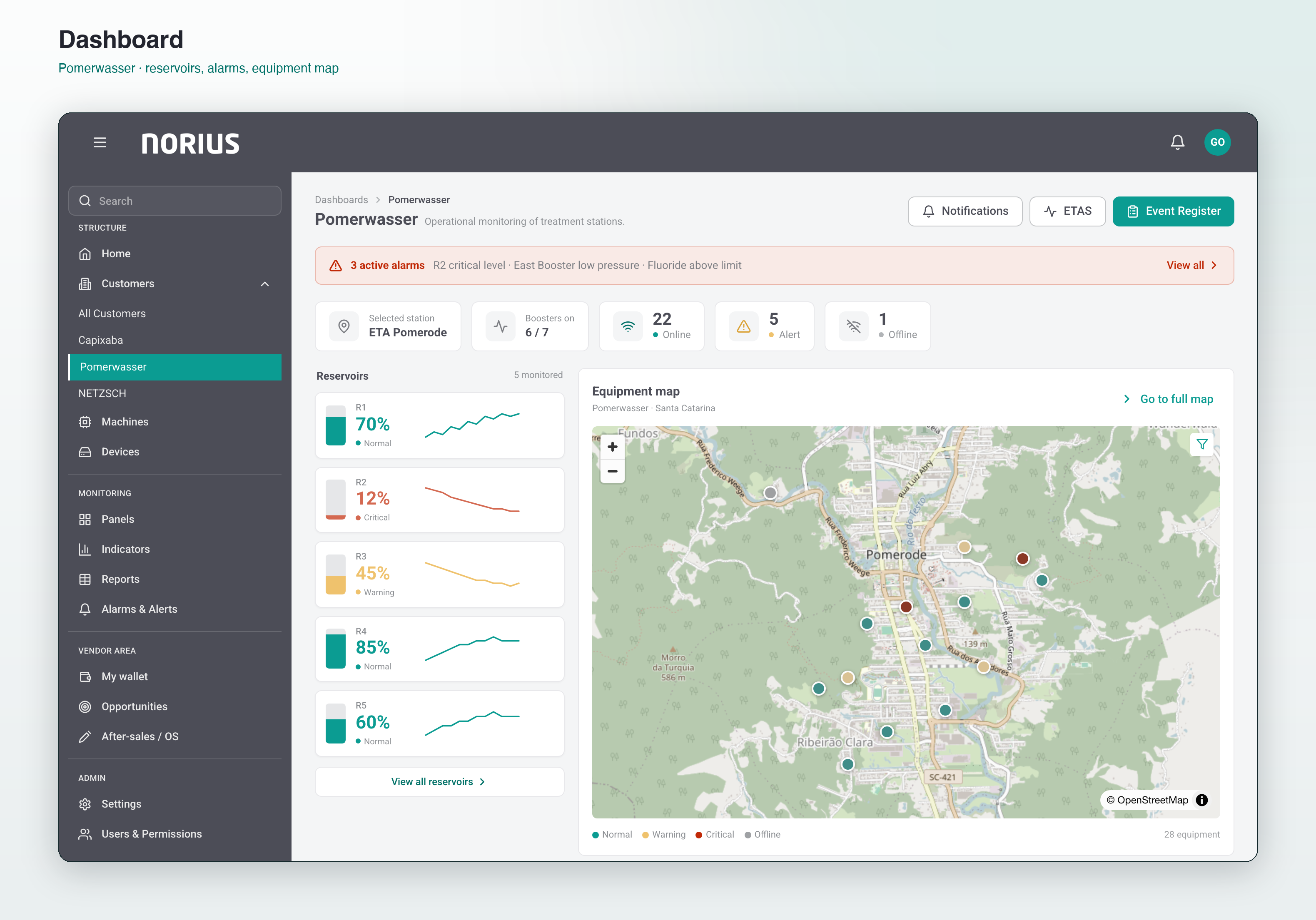
The client has a working design system with a hosted Storybook, 51 Figma pages mirroring the components, and a navigable prototype that grew into a small product: dashboard with live reservoir sparklines, full equipment map with status-filtered device panel, per-reactor ETA screens with realtime charts, a device inventory, alarm queues, and an event register that audit-logs every operator action. All of it in English, ready for client validation.
Three principles run through all of it: alarm severity reads by shape and color, not color alone; time-series charts use straight segments, not smoothed curves; destructive actions like stopping a pump require a typed reason.
Who I designed for
Three people with different relationships to the same data.
The field operator works from a tablet, sometimes on weak 4G, and needs to confirm whether a pump is running or which alarm fired. No time to explore, so the answer has to be visible.
The operations supervisor reads the whole site through the map before drilling into one point. The maintenance engineer needs hour-meters, start history, and threshold config for diagnosis, a depth that shouldn't sit in the operator's way.
The two tenants complicate it: Pomerwasser monitors reservoirs and water chemistry, Capixaba monitors pump pressure and power. Different data, shared interface.
The key decision: one system, not two products
The tempting path was two products, one per tenant. I chose one design system with the differences controlled by tokens and feature flags.
Pomerwasser doesn't need a pressure gauge; Capixaba doesn't need fluoride indicators. But both need the alarm card, device header, sidebar, map, and KPI card to behave identically. Splitting the products would double the maintenance for no user benefit. So the components on every screen of both tenants became the non-negotiable base, and tenant-specific pieces slot in through flags without touching the rest.
The design system lives in code
Norius's design system isn't a Figma library with good intentions about implementation. It's a running Storybook: 33 component families, 179 documented stories, every story with controls, accessibility checks, and MDX docs that say when to use the component and when not to.
The showcase piece is the RealtimeAreaChart, the dual-axis chart behind the ETA screens: level and pressure on opposite axes, threshold markers, a range navigator, eleven configurable props. It exists identically in Figma (as a component the client reviews) and in code (as the thing the dev ships). The domain components carry the industrial weight: tank cards with ten documented states, gauge rows for pressure and flow, alarm cards in seven severity-and-state variants.
What didn't go well
Discovery showed me that some of the original platform's odd UX was actually rational once you understood the operational context. I redesigned two interaction patterns before realizing the problem wasn't the pattern, it was the missing visual context that made it confusing. That cost a few days.
The prototype also outgrew its brief. It started as five screens for the client to click through and became a small product: equipment map, device inventory, event register, per-reactor ETA screens, remote-operation controls. Worth it (the client gave specific feedback instead of approving static frames) but the scope crept past what the contract covered.
Selected screens
" Building the design system in code alongside Figma is the decision I'd make again without hesitating. Writing the MDX docs forced answers to questions Figma never asks, like when a component should not be used, or what its error behavior is. Those answers are exactly what the dev handoff needs. "
TechCo.lab
→Designer-owned full stack. Concept to live URL with Figma Make + vibe coding.