MyCT
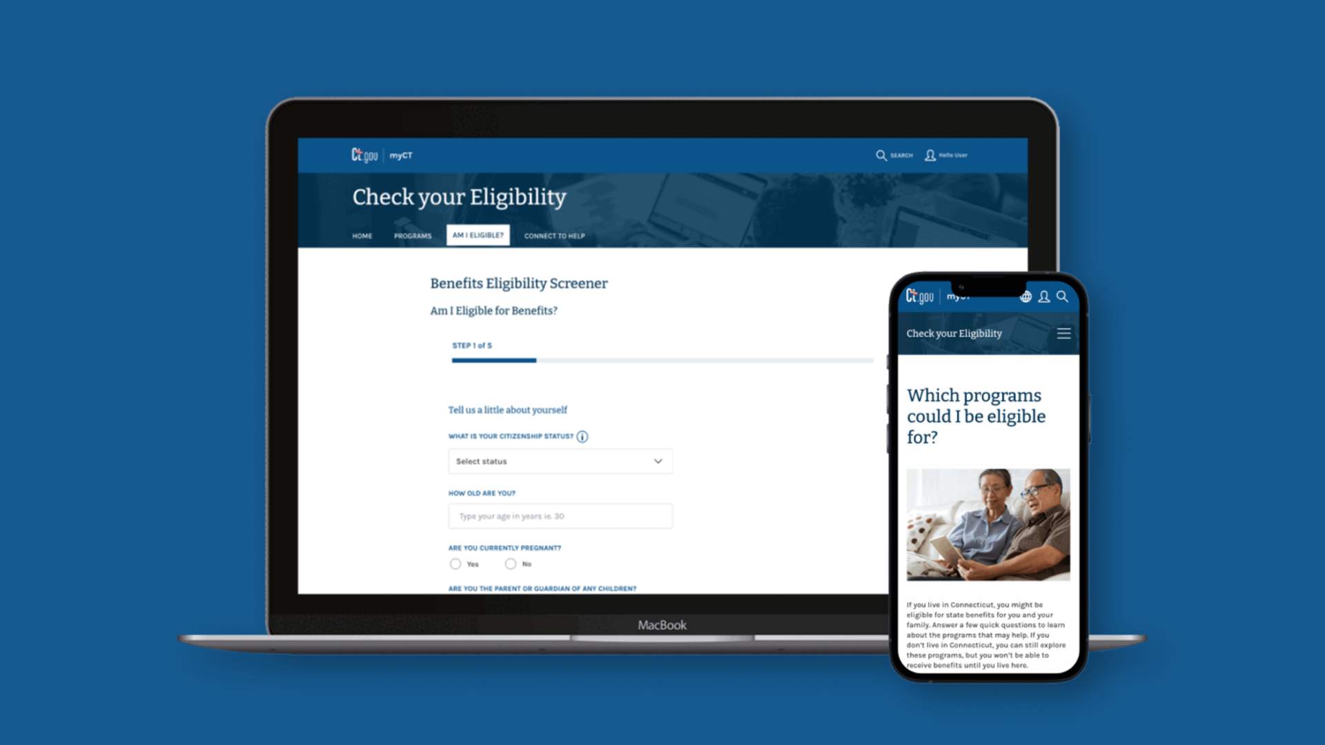
MyCT is the citizen-facing portal for the State of Connecticut: DMV, taxes, benefits, licenses. The redesign had to work for a 17-year-old on a phone in a parking lot and an 80-year-old at a library kiosk.
- WCAG 2.1 AA
- Accessibility target
- 63%
- Mobile-first traffic share
- Grade 6
- Reading level target
Challenge
Government services aren't optional. If the portal is hostile, citizens lose access to things they're entitled to. The legacy site was desktop-first, jargon-heavy, and gated behind agency-shaped navigation that made sense to civil servants and nobody else.
The ask was to rebuild around the things citizens are actually trying to do ("renew my license", "check my refund") with mobile and accessibility treated as constraints rather than afterthoughts.
Approach
Reorganized the IA around top tasks instead of agencies. Every page rewritten in plain language at a Grade 6 reading level, validated with citizen panels that included older adults and ESL users. Designed mobile-first using USWDS-aligned components so the experience felt familiar across .gov properties.
Each component shipped with accessibility receipts. Keyboard traps, focus order, screen reader labels, and contrast all tested against WCAG 2.1 AA. Not stamped, tested.
Outcome
The relaunched experience hit AA across the audited surface. Mobile became the dominant traffic pattern. Time-to-task on the top five flows (license renewal, refund status, benefits eligibility, business filings, vehicle registration) measurably dropped.
The pattern library carries forward to other state services as a baseline.
Who I designed for
Three citizens stayed pinned above my monitor for nine months.
A single mom on a bus with a cracked-screen Android, trying to renew her license between stops. She needs the answer in three taps and large enough type to read in motion.
A retiree at a public library kiosk with a mouse he doesn't fully trust. He needs the page to make sense without him having to learn a new interaction model.
A recent immigrant whose English is functional but not native. He needs plain language that explains the thing without burying the action.
If any of those three couldn't finish the task, the design failed. Everything else was negotiable.
The key decision: tasks instead of agencies
The legacy IA was organized by which state agency owned the workflow. Tax stuff lives under Department of Revenue Services. License stuff under DMV. Benefits under Social Services. That's how the government is structured internally and it had nothing to do with how citizens think.
We rebuilt the entire homepage and primary navigation around verbs the citizen would actually search for. "Renew". "Check". "Apply". "Pay". The agency surfaces are still there as a secondary path, but the front door is task-shaped.
This was the call that took the longest to defend. Agency stakeholders push back when they lose top-level real estate. The win came from analytics: the legacy nav had a 60%+ bounce rate from the homepage, and the citizen panels couldn't find common tasks without help. Once the data was on the table, the verb-first IA stopped being a design opinion and became the obvious move.
What didn't go well
Testing with older adults was harder than I planned for. The remote sessions we set up worked fine for younger users but kept breaking for the 70+ group: Zoom failures, screen-share issues, microphone permissions. We switched to in-person sessions at libraries and senior centers, which got better data but cost weeks I didn't have in the budget.
The other miss was scope creep on copy. Plain language is a discipline, and rewriting hundreds of pages to a Grade 6 reading level surfaced legal wording the agency lawyers wouldn't sign off on. Several flows ended up shipping with a plain-language summary on top and the legal wording kept below. It's a compromise that works, but it isn't as clean as I wanted.
Selected screens
" Public-sector design is the most honest UX work I've done. No growth metric, no funnel optimization. Just whether someone can do the thing they came to do. The bar is don't be in the way. "
Nerida
→Modular platform for solo health professionals in Brazil. Psychologists in production, nutritionists in beta. Designed, built, and operated solo.